How to Design Stamped Concrete Right
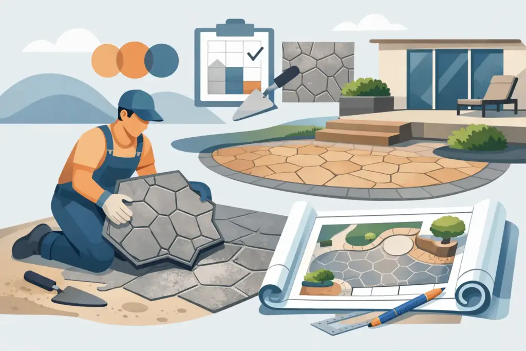
A stamped concrete patio can look sharp on day one and still feel wrong every time you pull into the driveway or step into the backyard. Usually, the problem is not the concrete itself. It is the design. If you are wondering how to design stamped concrete, the best place to start is not with a pattern book. It is with how the space is used, how the home looks, and how the surface will hold up over time.
Stamped concrete works best when appearance and function are planned together. A good design has the right scale, the right texture, the right color range, and the right layout for the property. Done properly, it adds curb appeal, improves usable outdoor space, and gives you a durable surface that feels finished instead of forced.
Start with the purpose of the slab
Before choosing a stone pattern or color release, look at the job itself. A front walkway, backyard patio, pool surround, and driveway all ask different things from the concrete. That matters because the design should match the traffic, the maintenance expectations, and the visual role of the surface.
A driveway usually benefits from a cleaner pattern and a color that hides dirt, tire marks, and winter wear. A patio gives you more freedom to use warmer tones, larger stone textures, or a more decorative border. A walkway should be easy to read visually and safe in wet weather, which means overly slick finishes or busy layouts can work against you.
This is where many homeowners make a mistake. They choose the stamp they like best in a sample board without thinking about how it will look over several hundred square feet. Good stamped concrete design starts with use first, style second.
How to design stamped concrete around the house style
Stamped concrete should look like it belongs to the property. The house already gives you a design direction through its brick, siding, roof color, trim, and overall shape. The concrete needs to support that, not compete with it.
If the home has traditional brickwork or classic masonry details, a natural stone or slate texture usually fits better than something that looks overly modern. If the exterior is simple and clean, a more understated ashlar or seamless texture can keep the job looking updated without becoming busy. Homes with strong warm tones often pair better with browns, tans, charcoal-browns, and sandstone shades. Cooler gray homes may work better with smoked grays, muted taupes, or blended charcoal finishes.
The goal is not to copy real stone perfectly. The goal is to create a surface that feels balanced with the house and surrounding hardscape. That includes steps, retaining walls, porch faces, and even nearby masonry features.
Choose the right pattern for the space
Pattern selection has more impact than most people expect. Large-scale patterns can make a patio feel more open, but they can also look oversized in a narrow walkway. Smaller patterns can add detail, but too much repetition across a large slab may feel crowded.
Ashlar slate is a common choice because it gives a clean stone look without becoming too irregular. Random stone patterns can look strong in larger patios and backyard living spaces where a more natural appearance makes sense. Brick-style stamps work well in some settings, especially near older homes or where you want a more formal look, but they need to be handled carefully so the finished slab does not look artificial.
Pattern depth matters too. Deeper texture creates stronger shadow lines and more visual movement, which can be attractive, but it may also collect more dirt and wear differently over time. For driveways and high-traffic areas, a pattern that balances texture with cleanability usually makes more sense than a deeply aggressive stamp.
Color matters more than the pattern
In many projects, color is what makes stamped concrete look high-end or makes it look like a bad imitation. The best color choices are usually natural, slightly muted, and tied to the materials already on the property.
Most stamped concrete uses a base color in the mix or hardener, followed by a secondary accent color that settles into the texture and highlights the pattern. That layered look creates depth. Without it, the slab can appear flat and manufactured.
The safest approach is to stay within the family of tones already present at the home. If the brick has warm reds and browns, a tan or walnut-toned concrete surface often sits well beside it. If the house has gray siding, white trim, and black accents, a cooler gray blend may be the better fit. Very bright colors and high-contrast combinations tend to date faster and show wear more obviously.
It also helps to think practically. Lighter colors stay cooler in the sun but may show stains sooner. Darker colors can feel rich and grounded, but they may absorb more heat and show fading if the sealer is not maintained. There is no one perfect answer. It depends on where the slab is installed and how you use the space.
Use borders and layout lines with restraint
Borders can give stamped concrete a more finished custom look, especially on patios, porches, and entry walks. But they only work when they support the shape of the slab. A border should frame the space, not call attention to itself.
A simple contrasting band around the edge can help define the perimeter and tie the concrete into nearby masonry or trim colors. On larger patios, a border can break up a wide area and make the installation feel more intentional. On small spaces, though, too many decorative cuts, multiple borders, or mixed stamp patterns can make the slab feel cramped.
Control joints and layout lines also need to be part of the design from the beginning. Concrete needs proper joints to manage cracking, and those joints should be placed where they make visual sense. Good design accounts for structural reality. You do not want a beautiful pattern laid out one way and the necessary cuts slicing awkwardly across it afterward.
Plan for scale, drainage, and traffic flow
This is the part homeowners do not always see in inspiration photos, but it is what separates a good-looking job from a dependable one. Stamped concrete has to work like concrete first. That means the slab should be properly graded, water should move away from the house, and the layout should support natural foot traffic and vehicle movement.
A patio that looks great but holds water is not a good design. A driveway with an elaborate pattern but poor slope will not stay attractive for long. A narrow walkway with heavy texture may feel tight and awkward instead of welcoming.
When designing the slab, think about where people approach from, where doors open, where furniture will sit, and how snow, rain, and runoff move across the area. The best stamped concrete design feels easy to use because the practical details were handled early.
Match the finish to maintenance expectations
Stamped concrete is durable, but it is not maintenance-free. That is why the design should match what the owner is realistically willing to maintain. Sealers need to be reapplied over time, surface color can soften with weather, and high-traffic areas may wear differently than sheltered ones.
If you want a lower-fuss finish, choose a pattern and color blend that ages gracefully and does not depend on dramatic contrast. Mid-range earth tones and natural stone looks usually hold up visually better than trendy colors or overly decorative effects. If the space gets heavy sun, road salt exposure, or frequent use, those conditions should influence the design choices from the start.
A serious contractor will talk through those trade-offs instead of selling the most decorative option on the board. At Sampson Concrete & Masonry, that practical approach matters because a stamped surface should still look good after real use, not just after the final wash and seal.
Common design mistakes to avoid
Most stamped concrete problems start with overdesign or poor coordination. Too much pattern variation, too many colors, or a finish that ignores the house can make the project feel disconnected. Another common issue is picking a stamp based on a small sample without considering the scale of the actual area.
Homeowners also underestimate how much surrounding materials affect the result. The concrete is not viewed alone. It sits beside lawn edges, steps, brick, siding, fences, and landscaping. A good design considers the full setting.
Then there is the installation side. Even the best design falls apart if the subgrade, forming, joint plan, coloring, stamping timing, and sealing are done poorly. Decorative concrete still depends on strong concrete practice. That is why design and workmanship should never be separated.
Getting the design right before the pour
If you are planning a new patio, driveway, porch, or walkway, gather a few reference ideas, but focus on your property first. Look at your home’s colors, measure the space honestly, and decide whether you want the concrete to stand out or blend in. In most cases, blending in with quality materials and clean execution creates the better long-term result.
A contractor should be able to guide you through pattern scale, color selection, borders, joint placement, and drainage without making the process complicated. That is what good trade experience looks like. It protects both the finish and the investment.
Stamped concrete should not feel like a showroom sample dropped onto your property. It should look built for the house, built for the way you live, and built to last. When the design is handled with that mindset, the finished slab does more than decorate the space. It improves how the whole property comes together.
If you are deciding on stamped concrete, slow down at the design stage. A few smart choices before the pour will save you from years of looking at a surface that could have been done better.